The Steady Hand
The handwriting you keep pinning to your vision board? Never a talent problem. Here’s the five-minute fix nobody’s told you about — no calligraphy pens required.
Karla Reed · Ink & Sealed Studio
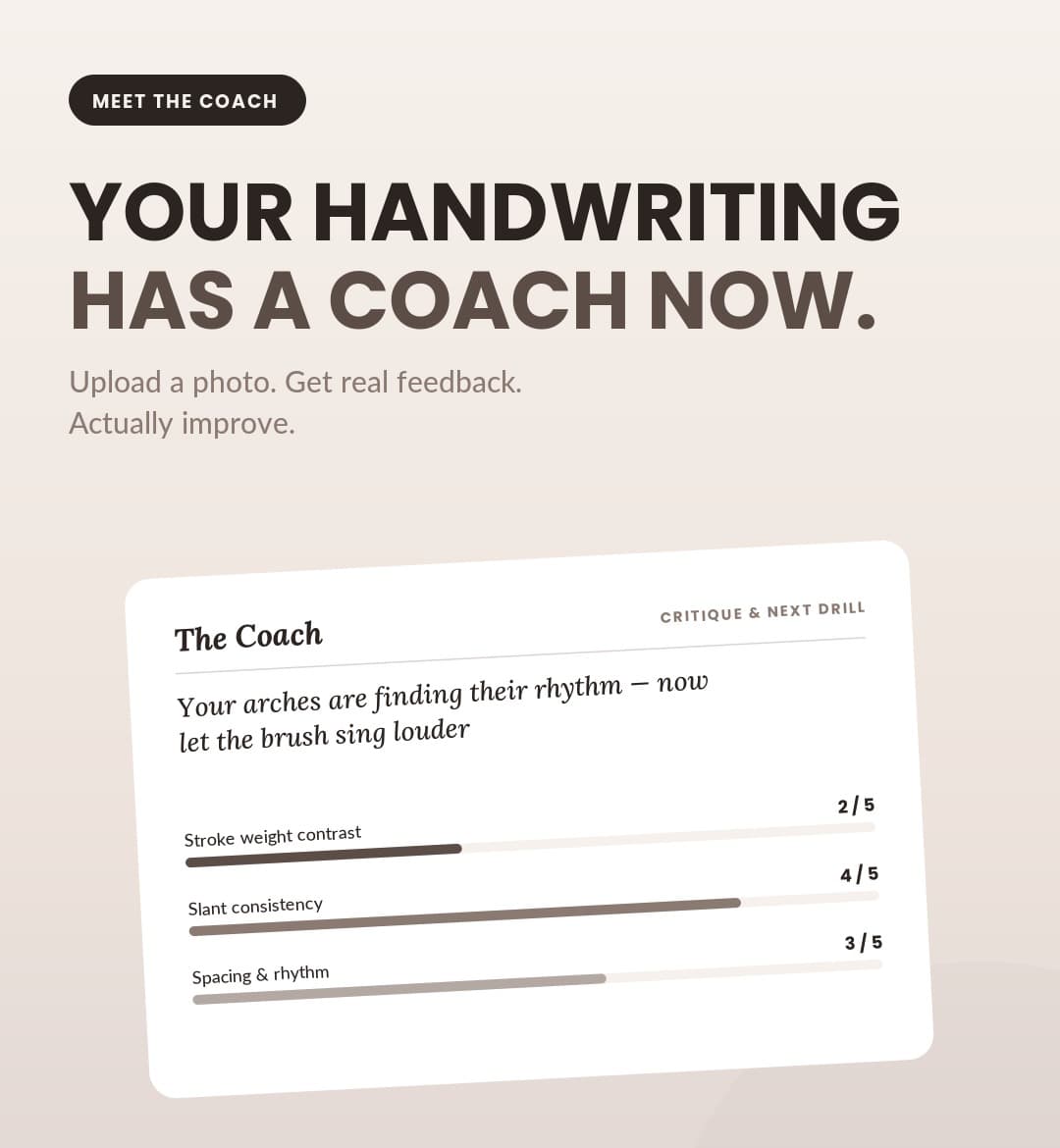
A real critique from The Coach — Creative Intelligence, trained on your actual hand, not a generic alphabet.
You don’t have bad handwriting.
You have uncoached handwriting.
Nobody’s ever shown your hand what it’s actually doing.
01 — The Hopeful Scribbler
Everyone’s journaling again. Not every page looks like the Pinterest board.
She bought the notebook with the linen cover. The good pens, the washi tape, the stickers shaped like flowers. She follows all the aesthetic accounts and opens to a blank page most mornings meaning to write something worth keeping — and three lines in, she closes it.
Not because she ran out of things to say. Because the handwriting looking back at her doesn’t match the version of this ritual she had in her head.
Meet The Hopeful Scribbler. She’s not chasing calligraphy fame — she just wants a page that looks like it was written by someone with her life together. (Relatable.)
It was never about talent. It was five specific things nobody ever pointed out to her — and once they’re named, they’re fixable in an afternoon.
02 — Quiet Luxury
The one signature you can’t buy off the shelf.
Quiet luxury was never about the logo — it’s the details only the observant catch: the weight of the paper, the cut of the coat, the way someone signs their name like they mean it. Handwriting belongs on that list. It’s the one marker of taste that can’t be picked up at a boutique or borrowed from a trend report.
You can buy the linen notebook. You can buy the good pen. The hand that fills the page? That’s the part money skips — and the part everyone actually notices.
So this was never really about closing a gap. It’s about owning the one signature that’s entirely, unmistakably yours.
03 — The Gap Nobody Names
“Just practice more” was never going to work
Practice without correction doesn’t build a better hand — it just grooves the current one in deeper. That’s the real gap between wanting better handwriting and actually getting it: the internet is full of alphabets to trace and nearly empty of anyone who’ll actually look at your page and tell you what’s happening on it.
Same gap as wanting a faster mile and actually watching your stride on video. You can want it for years. Watching it fixes it in a week.
04 — The Reframe: Mechanics, Not Magic
She becomes The Steady Hand
Here’s the reframe that changes everything: handwriting was never a mysterious quality called “neatness.” It’s five separate, nameable, fixable mechanics — stroke weight, slant, spacing, baseline, and consistency of form. Good news: that means it’s learnable, not innate. No natural talent required, just the right attention.
The version of her handwriting she’s chasing was never about more talent. It was always just five things, watched and named, one gorgeous page at a time.
That’s the whole shift — from The Hopeful Scribbler, quietly comparing her page to someone else’s, to The Steady Hand: someone whose handwriting finally matches the taste she already has.
The Six Things Your Hand Is Actually Doing
- Stroke weight contrastDownstrokes press wide, upstrokes stay light. Flat weight reads flat no matter how neat the letters are.
- Slant consistencyEvery letter leaning the same angle is what makes a page look like one hand wrote it.
- Spacing & rhythmThe gaps between letters carry as much feeling as the letters do.
- Baseline & x-heightWhere letters sit and how tall they stand — wander here and the page feels unsteady.
- Entry & exit strokesHow one letter leads into the next is what makes writing look connected, not assembled.
- Consistency of formThe same letter should look like itself every time it shows up.
Quick Gut-Check
- 1When did you last write for yourself, not for how it would look?
- 2Could you name the one thing that's actually off about your last page?
- 3Has anyone ever shown you what to fix — specifically, not just "practice more"?
- 4What would your handwriting look like if you weren't self-conscious about it?
The Breakdown
Six mechanics. One page that finally looks like you.
Stroke Weight Contrast
Press into the downstroke, release on the up. Without contrast, even careful letters look mechanical instead of alive.
Slant Consistency
One consistent angle across every letter is what unifies a page — more than any single letterform does on its own.
Spacing & Rhythm
Too tight and the words fight each other. Too loose and the line falls apart. Rhythm lives in the gaps.
Baseline & X-Height
A wandering baseline is the fastest way to make careful letters look careless. This is often the first fix that changes everything.
Entry & Exit Strokes
The lead-in and lead-out of each letter is what makes a word read as connected, not typed by hand one letter at a time.
Consistency of Form
The same letter, written twenty times on a page, should look like the same letter twenty times. This is what "practice" actually builds.
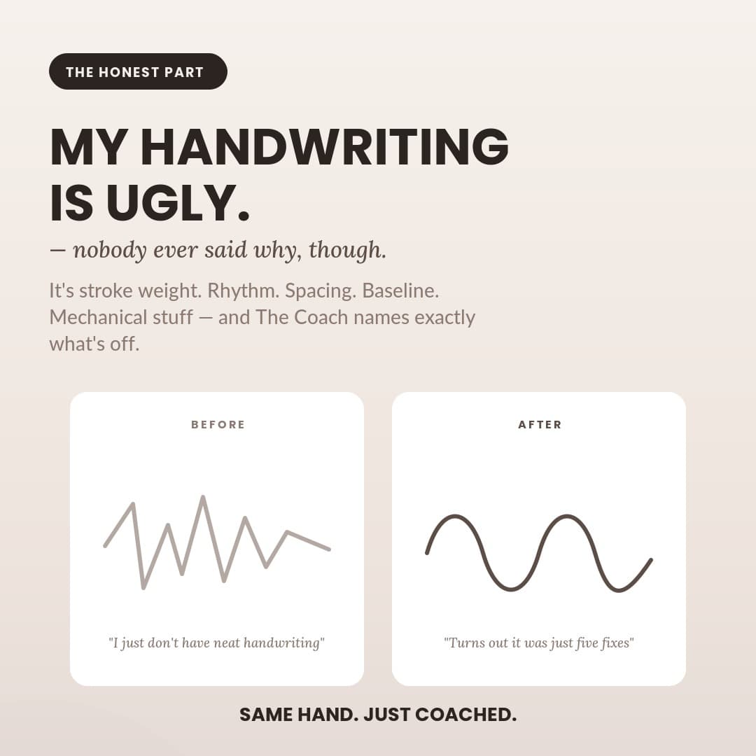
Same hand. Just coached.
Your hand was never the problem.
Most people quit right before the fixable part. The Lettering Atelier is for the ones who keep going — critiqued, not just cheered on, one gorgeous page at a time.